Notification
No accessibility annotations are needed for notifications, but keep these considerations in mind if you are modifying Carbon or creating a custom component.
What Carbon provides
Carbon bakes keyboard operation into its components, improving the experience of blind users and others who operate via the keyboard. Carbon incorporates many other accessibility considerations, some of which are described below.
Keyboard interactions
Users can navigate through the interactive elements within the notification using the
Tab
Space
Enter
Escape
Inline and toast
Inline and toast notifications do not contain interactive elements. They use the roles of
status
alert
log
Actionable
Actionable notifications may contain interactive elements such as links and buttons. This component grabs and traps focus until an action is taken or the notification is dismissed. Users can navigate through the interactive elements using the
Tab
Space
Enter
Escape
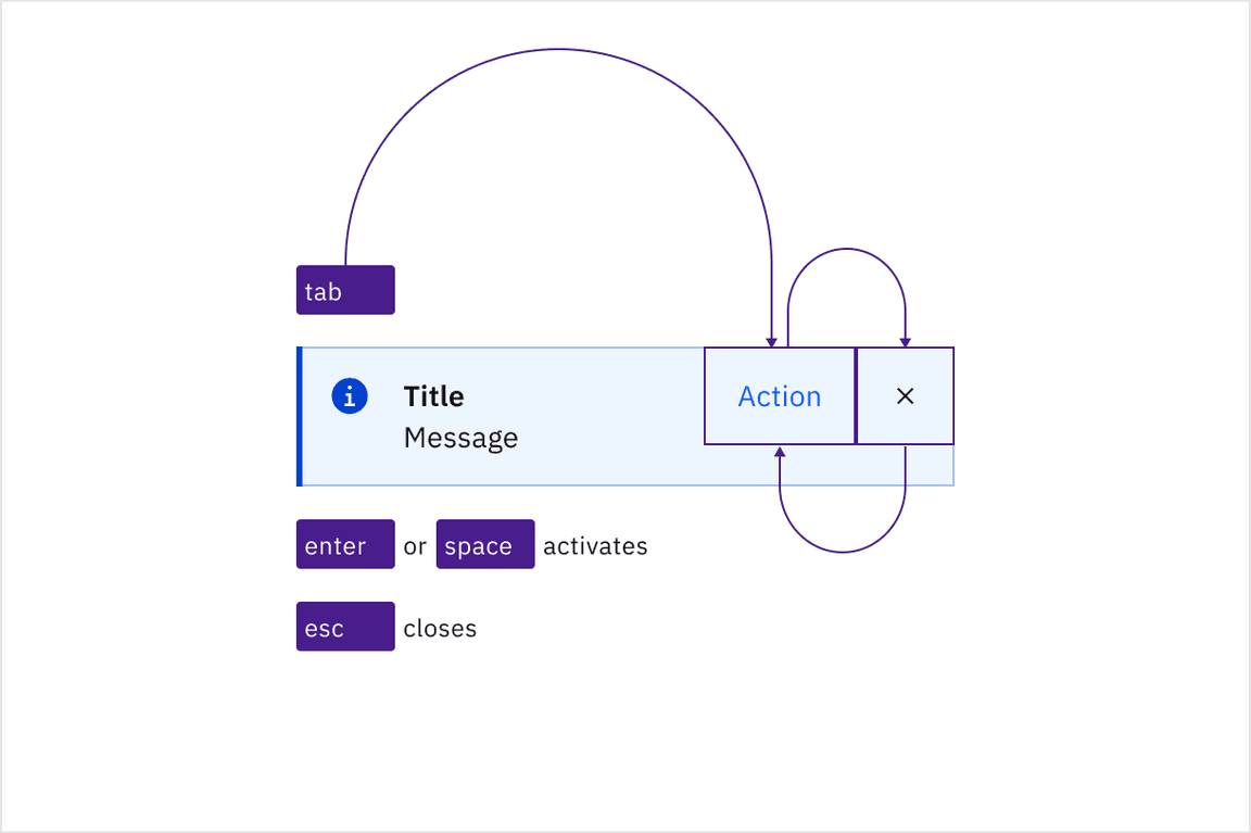
Focus trapped until an action is taken or the notification is dismissed.
Callout
A Callout is not automatically announced by screen readers. It can include interactive elements such as links, which users can navigate through using the
Tab
Space
Enter
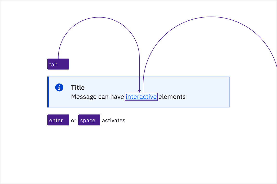
Navigating through interactive elements using the Tab key.
Design recommendations
Semantic styling
When using semantic styling on notifications, it’s crucial to ensure accessibility by providing clear, concise text. Colours used to indicate status should always be paired with icons to avoid reliance on colour alone.
Text
It is recommended that notification messages use plain text, as semantic styling such as bold or italic and structural elements like
<li>
Icon and colours
Ensure that screen readers can access the icon within the Callout to convey the type or semantic meaning of the message. The icon should have descriptive alt text that provides context about the Callout’s type (e.g., information or warning). This helps users understand the nature and importance of the message.
Development considerations
Use a role of
alert
log
status
alertdialog
Special care should be given to focus management for notifications with interactive elements or actions. Venturing beyond using a role of
alert
log
status
alertdialog
- Collect notifications in a persistent area in your application for users to be able to navigate to and take action on notifications.
- Render notifications in an already-existing that can be accessed via a hotkey. Focus should jump to the notification region after the hotkey is invoked. Once the user has reached the end of the region, focus should return to the previously focused item in the document before the hotkey was invoked.region
Neither approach is perfect, but with either one: ensure notifications are properly announced, respect user timeout preferences, and ultimately provide an easy way to be navigated to by keyboard/screenreader to take action.
Accessibility testing statusFor every latest release, Carbon runs tests on all components to meet the accessibility requirements. These different statuses report the work that Carbon has done in the back end. These tests appear only when the components are stable.
For every latest release, Carbon runs tests on all components to meet the accessibility requirements. These different statuses report the work that Carbon has done in the back end. These tests appear only when the components are stable.
Latest version: | Framework: React (@carbon/react)
| Component | Accessibility test | Status | Link to source code |
|---|---|---|---|
| Notification | Test(s) that ensure the initial render state of a component is accessible. | Passes all automated tests with no reported accessibility violations. | GitHub link |
| Tests that ensure additional states of the component are accessible. This could be interactive states of a component or its multiple variants. | Passes all automated tests with no reported accessibility violations. | ||
| Tests that ensure focus is properly managed, and all interactive functions of a component have a proper keyboard-accessible equivalent. | Passes all automated tests with no reported accessibility violations. | ||
| This manual testing ensures that the visual information on the screen is properly conveyed and read correctly by screen readers such as JAWS, VoiceOver, and NVDA. | A human has manually tested this component, e.g. screen reader testing. |